2025 Data Reporting & Visualization (All Newsroom Sizes) Winners 2

About the Winners:
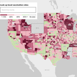
Reporters Lauren Weber and Caitlin Gilbert sought school-level measles vaccination rates and exemption data for kindergartners from all 50 states and D.C. They collected data through publicly available government websites, state and local agencies, and public records requests.
The result from The Washington Post team: an exclusive data analysis showing that the share of U.S. counties that have 95 percent vaccination rates for measles, which provides herd immunity, has dropped from 50 percent before the pandemic to 28 percent. This means that the number of children in unprotected communities rose from 3.5 million to at least 5.2 million during this period.
Comments From the Judges:
“This is an impressive, large-scale project for a news organization of any size. Ambitious data collection and clear methodology; telling photographs; graphics that efficiently showcase overall trends as well as neighborhood facts; authoritative reporting and clear writing; examples that put a reader on the ground.”
“The data visualizations are gorgeous, complex, yet accessibly informative. The variety of graphics provided were engaging and cohesive, specifically across the range of regions highlighted within the article (Minneapolis, Detroit, Chicago, and Seattle). The pre-pandemic vs post-pandemic vaccination rate map across the United States was incredibly effective at illustrating the current shifts in vaccination rates and how the majority of the country is now at risk of failing recommended herd immunity status.”
Photo credits: Joshua Lott/The Washington Post; courtesy of The Washington Post