Show, Don’t Tell: The Power of Visualizing Data
Photo courtesy of Tampa Bay Times
Photo courtesy of Tampa Bay Times
In an era when data is more accessible than ever, how can journalists convey that information in a compelling way that gets beyond the numbers?
One strategy is to convert the data into visual representations that help to tell the story. Such visuals range from elaborate, interactive maps to a simple dot.
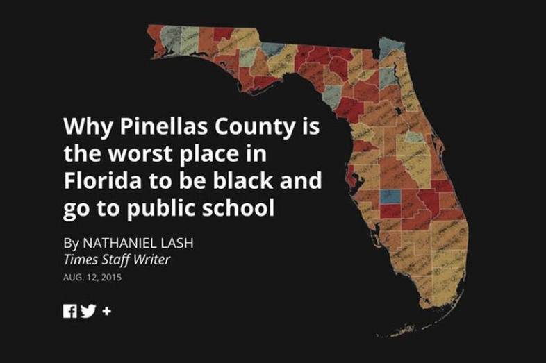
The Tampa Bay Times’ Failure Factories series begins with colorful, interactive maps and graphics that show how black students are trapped in some of Florida’s lowest performing schools. St. Louis Public Radio used collections of dots to create a visual narrative about racial disparities in school suspensions.
Award-winning journalists offered specific examples of how they have used data to illustrate some of the issues in education that can be hardest to picture — equity, poverty, and diversity, during a standing-room-only panel at the Education Writers Association’s national conference in Washington, D.C., earlier this year.
‘Start With the Basics’
Brent Jones of St. Louis Public Radio said that when he thinks of how to visualize a data source, he treats the data as if he were interviewing a person.
“What would you ask?” Jones said. “I start with the basics.”
For Jones, “the basics” of a data story that went on to win an EWA award this year was this: How many suspensions were served to K-3 students in Missouri during one year?
The number he came to was 21,463. That statistic drove the rest of the project, which focused on racial disparities in suspensions of young students, and was featured on the We Live Here podcast. The data visualization was simple: line after line of blue dots that help the reader put in perspective just how large that number is.
“We wanted to lead readers through the story while paying attention to the scale,” he said. “That translated into lots of dots.”
Nathaniel Lash’s team at the Tampa Bay Times also started with a question when they analyzed data that would inform their Pulitzer Prize-winning series, Failure Factories.
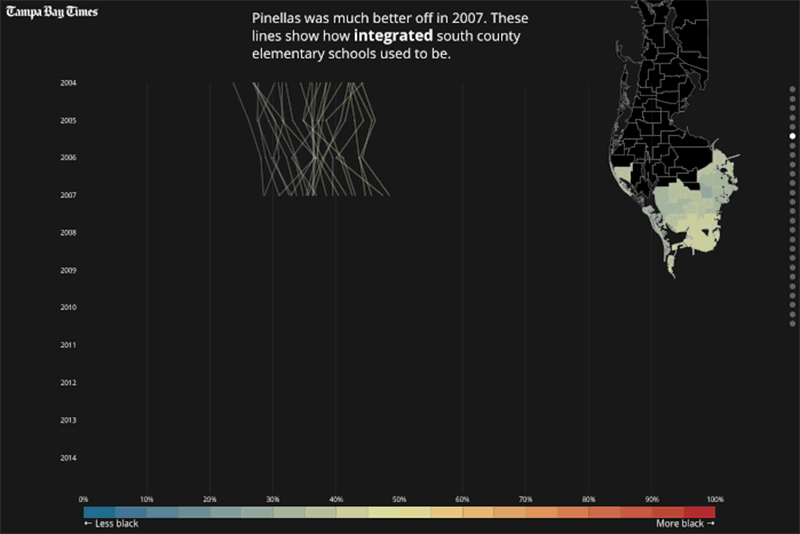
The five-part series on elementary schools in St. Petersburg, Florida, contains powerful interactive graphics that illustrate how Pinellas County schools became more segregated and lower performing over time.
Lash said test scores were the “canary in the coal mine” when it came to finding these schools, but that they couldn’t just use test score data to tell the whole story.
“Test scores show you that something is wrong, but they’re not going to tell you what’s wrong,” Lash said. “Especially in high-poverty, high-minority populations, (test scores) alone are not going to tell you what’s happening over time.”
Lash recommended that reporters track “measurable inequities,” such as suspensions, turnover rates, funding discrepancies and access to special programs.
Interactive Maps
Looking to better measure inequities is one of the reasons Rebecca Sibilia launched EdBuild three years ago, a nonprofit that focuses on education funding and inequality. Sibilia said she believes that funding systems are outdated and socioeconomically segregating, and she wanted her organization to visualize that inequity in an accessible way.
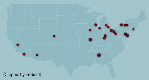
Sibilia showed journalists EdBuild’s interactive maps, from America’s most segregated school boundaries to state-level funding inequities, which are based on the organization’s collection of data and analysis.
She encouraged journalists to root their data projects in geography, and to capitalize on the data visualizations EdBuild had already created.
“We will export data and put into usable graph and visualization for you,” she said. “We’re here to help you build these stories.”
Your post will be on the website shortly.
We will get back to you shortly