Finding Stories in College Scorecard Data
Webinar recap.
Webinar recap.
The best data are often the hardest to parse. Sure, a neat snapshot of three or four variables is easy on the eyes, but to really dig deep and find important and surprising trends, you’ll probably have to wade through dozens of variables.
Or in the College Scorecard’s case, 2,000 variables.
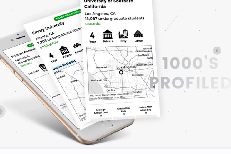
Last week’s EWA Scorecard webinar showed reporters how to download and analyze the federal government’s database on repayment rates, student-debt levels, low-income student enrollment and average wages after graduation – all sorted by college. [Slides from the event are here and here]
The webinar came at a good time, too: Last week Google announced it was including key Scorecard data for certain searches about a university or college. Here’s the internet giant with more.
This discussion, a recording of which appears on this page, includes important tips and shortcuts to help you get started reviewing crucial digits about the colleges you cover, such as skipping past hundreds of variables you don’t need to focus on the few you do. Example: “rpy_3yr_rt” stands for the three-year repayment rate for past students of that institution.
Ben Miller, director of postsecondary issues at Center for American Progress, explained that the Scorecard aims to be two things: a consumer tool for college applicants – with bite-sized statistics that officials believe are the most useful for future students – and a much more robust set of data files with many of the details that reporters and researchers salivate for.
To begin, head to this link and review the datasets available. Miller encourages reporters to start with the most recent data. If you want comparisons over time for variables such as Pell enrollment, the larger “download all data” is in order. Your next job is to download the data dictionary, which defines the shorthand the datasheets use to mark each variable. Without this Rosetta stone, you’re unlikely to make sense of the roughly 2,000 columns in front of you. Studying the data dictionary may also prompt you to consider data details you weren’t previously searching for, such as information on veterans.
The webinar also imparts important caveats and clarifications:
Your post will be on the website shortly.
We will get back to you shortly